ART IMITATING LIFE? FINDING LOGO INSPIRATION
I’ve used this phrase before... More as a cultured conversation addition, but without too much real thought. In preparing for this article I had to review its meaning. I knew my topic was relation to this phrase; but exactly how?
So according to (hopefully credible) internet sources, it’s the process of observing how art has sprung from true-events (ie. life). Makes sense right? A phrase made popular by Oscar Wilde.
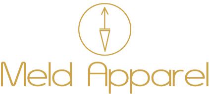
I think this phrase particularly comes into relevance when discussing Glyphs use in pop-culture. Up until a few weeks ago I was alerted to the connection between the Meld logo and glyphs. I myself had witnessed the rise of popularity of arrows in tattoo art. I sought to harness meaning through this art form to articulate, what ‘Meld’ meant to clothing. The philosophy of creating hybrid, ultra wearable clothes, where neither comfort, nor style are compromised- clothes for any time or place. This manifested in the two arrows in Meld’s logo; representing time (the clock hand on top), and place (the compass hand below).
There was no more thought given to it than that… Then my friend asked “How did you decide to connect glyphs to your logo?”
“Glyphs? You mean the ancient Egyptian wall art?”
After some further investigation, I now understand that glyphs are a pictorial/symbolic representation of an understanding. Glyphs transcended far beyond the ancient world, and still help to shape meaning in the modern world. As subliminal messages, shapes convey meaning to influence thought processes. Definitely a great example of life imitating art!
Exploring the use of glyphs in the modern tattoo art, the general idea is that the arrows often stand for adventure, or a journey; a direction of travel. Looking upon the symbol reminds the wearer, that they aren’t ‘there’ yet. There is more to be seen, done, explored. Within the space of everyday life, it can be a symbol of hope, for life to come. There are more specified meanings depending on the composition, but that’s that general idea; as I found it.
Specifically then looking at the two arrow images on the Meld logo I was presently surprised to see that the arrow pointing up- means “new life”! This so adequately captures the meaning of Meld, helping inspire and empower women; through fashion to the life of their dreams. The bottom “V” is a feminine symbol, symbolising a valley or the earth. I am blown away by this symbols connection to femininity; something Meld seeks to promote within designs. These clothes are meant to inspire women to get active in nature; and we have an evolving eco-range in the works!
I find these connections- incredible! In every sense of the word! But then, perhaps the ideation of the logo, was simply an external expression of living? Perhaps the subliminal messages are already so ingrained within? Did I already understand the connection to the symbols, before I gained concrete evidence? A curious thought.
